This is just a collection of code I have found very useful when doing data visualization in Python. When making plots, I’d like to use Seaborn if possible, which is a Python visualization library based on matplotlib. It provides a high-level interface for drawing attractive statistical graphics and integrates with the functionality provided by Pandas DataFrames.
Some of the code come from online resources which I will mention in the comments of the code.
%matplotlib inline
import matplotlib.pyplot as plt
import seaborn as sns
import numpy as np
import pandas as pd
Here are the datasets from Seaborn that will be used in the examples.
titanic = sns.load_dataset("titanic")
tips = sns.load_dataset("tips")
iris = sns.load_dataset("iris")
titanic.head()
| survived | pclass | sex | age | sibsp | parch | fare | embarked | class | who | adult_male | deck | embark_town | alive | alone | |
|---|---|---|---|---|---|---|---|---|---|---|---|---|---|---|---|
| 0 | 0 | 3 | male | 22.0 | 1 | 0 | 7.2500 | S | Third | man | True | NaN | Southampton | no | False |
| 1 | 1 | 1 | female | 38.0 | 1 | 0 | 71.2833 | C | First | woman | False | C | Cherbourg | yes | False |
| 2 | 1 | 3 | female | 26.0 | 0 | 0 | 7.9250 | S | Third | woman | False | NaN | Southampton | yes | True |
| 3 | 1 | 1 | female | 35.0 | 1 | 0 | 53.1000 | S | First | woman | False | C | Southampton | yes | False |
| 4 | 0 | 3 | male | 35.0 | 0 | 0 | 8.0500 | S | Third | man | True | NaN | Southampton | no | True |
tips.head()
| total_bill | tip | sex | smoker | day | time | size | |
|---|---|---|---|---|---|---|---|
| 0 | 16.99 | 1.01 | Female | No | Sun | Dinner | 2 |
| 1 | 10.34 | 1.66 | Male | No | Sun | Dinner | 3 |
| 2 | 21.01 | 3.50 | Male | No | Sun | Dinner | 3 |
| 3 | 23.68 | 3.31 | Male | No | Sun | Dinner | 2 |
| 4 | 24.59 | 3.61 | Female | No | Sun | Dinner | 4 |
iris.head()
| sepal_length | sepal_width | petal_length | petal_width | species | |
|---|---|---|---|---|---|
| 0 | 5.1 | 3.5 | 1.4 | 0.2 | setosa |
| 1 | 4.9 | 3.0 | 1.4 | 0.2 | setosa |
| 2 | 4.7 | 3.2 | 1.3 | 0.2 | setosa |
| 3 | 4.6 | 3.1 | 1.5 | 0.2 | setosa |
| 4 | 5.0 | 3.6 | 1.4 | 0.2 | setosa |
sns.set() # switch to seaborn defaults
Bar plots and Points plot
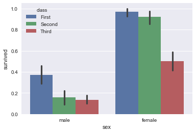
In Seaborn, the barplot() function operates on a full dataset and shows an arbitrary estimate, using the mean by default. When there are multiple observations in each category, it also uses bootstrapping to compute a confidence interval around the estimate and plots that using error bars
sns.barplot(x="sex", y="survived", hue="class", data=titanic);
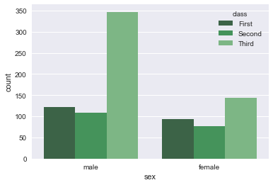
If we want to show the number of observations in each category rather than computing a statistic for a second variable, we can use countplot().
sns.countplot(x="sex", hue='class', data=titanic, palette="Greens_d");
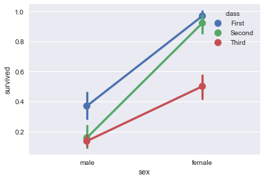
An alternative style for visualizing the same information is offered by the pointplot() function. This function also encodes the value of the estimate with height on the other axis, but rather than show a full bar it just plots the point estimate and confidence interval.
sns.pointplot(x="sex", y="survived", hue="class", data=titanic);
# To make figures that reproduce well in black and white,
# it can be good to use different markers and line styles for the levels of the hue category:
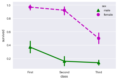
sns.pointplot(x="class", y="survived", hue="sex", data=titanic,
              palette={"male": "g", "female": "m"},
              markers=["^", "o"], linestyles=["-", "--"]);
Box plots
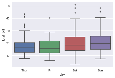
sns.boxplot(x="day", y="total_bill", data=tips);
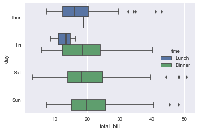
sns.boxplot(x="total_bill", y="day", hue="time", data=tips);
Multi-panel categorical plots
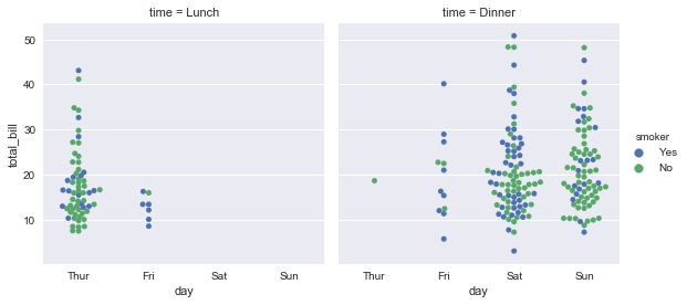
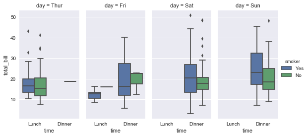
factorplot() is the higher-level function that draws a categorical plot onto a FacetGrid. The default plot that is shown is a point plot, but other Seaborn categorical plots can be chosen with the kind parameter, including box plots, violin plots, bar plots, or strip plots.
sns.factorplot(x="day", y="total_bill", hue="smoker",
               col="time", data=tips, kind="swarm");
# Because of the way FacetGrid works, to change the size and shape of the
# figure you need to specify the size and aspect arguments, which apply to each facet:
sns.factorplot(x="time", y="total_bill", hue="smoker",
               col="day", data=tips, kind="box", size=4, aspect=.5);
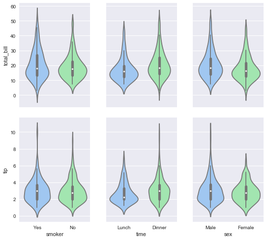
g = sns.PairGrid(tips,
                 x_vars=["smoker", "time", "sex"],
                 y_vars=["total_bill", "tip"],
                 aspect=.75, size=3.5)
g.map(sns.violinplot, palette="pastel");
Scatter plots
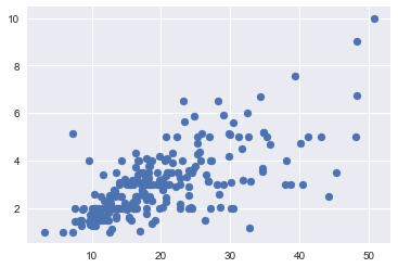
plt.scatter(x="total_bill", y="tip", data=tips);
# Or
# sns.regplot(x="total_bill", y="tip", data=tips, fit_reg=False)
Line plots
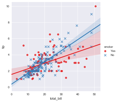
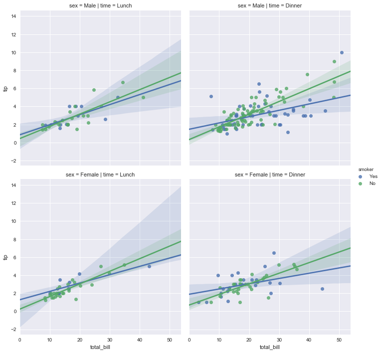
sns.lmplot(x="total_bill", y="tip", hue="smoker", data=tips,
           markers=["o", "x"], palette="Set1");
sns.lmplot(x="total_bill", y="tip", hue="smoker",
           col="time", row="sex", data=tips);
Histogram and Densities
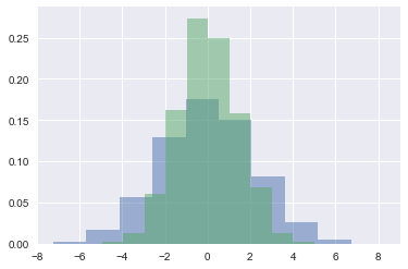
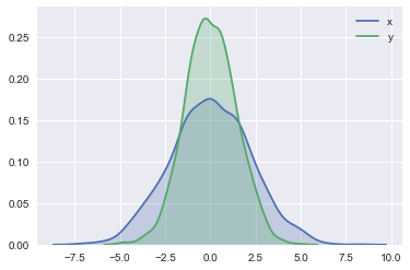
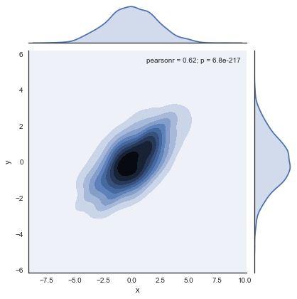
plt.hist()will generate histogramsns.kdeplot()will generate a smooth estimate of the distribution using a kernel density estimationsns.distplot()will combine histograms and kernel density estimationsns.jointplot()will generate both the joint distribution and the marginal distribution
# The code comes from the book "Python Data Science Handbook" by Jake VanderPlas
data = np.random.multivariate_normal([0, 0], [[5, 2], [2, 2]], size=2000)
data = pd.DataFrame(data, columns=['x', 'y'])

for col in 'xy':
    plt.hist(data[col], normed=True, alpha=0.5)
# The code comes from the book "Python Data Science Handbook" by Jake VanderPlas
for col in 'xy':
    sns.kdeplot(data[col], shade=True)
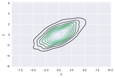
If we pass two variables to kdeplot(), it will generate a two-dimensional plot of the kernel density estimation.
sns.kdeplot(data['x'], data['y']);
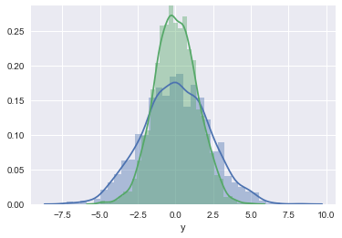
sns.distplot(data['x'])
sns.distplot(data['y']);
# # The code comes from the book "Python Data Science Handbook" by Jake VanderPlas
with sns.axes_style('white'):
    sns.jointplot("x", "y", data, kind='kde'); # By dafault, it will the histogram instead of kde
# To generate a hexagonally based histogram, set kind='hex'
Pair plots
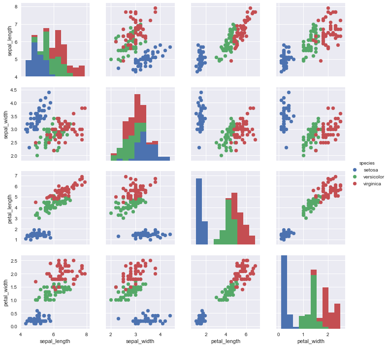
PairGrid is for plotting pairwise relationships in a dataset.
g = sns.PairGrid(iris, hue="species")
g = g.map_diag(plt.hist)
g = g.map_offdiag(plt.scatter)
g = g.add_legend()
# We can also specfy how the how lower triangular part and upper part, e.g.
# g = g.map_upper(plt.scatter)
# g = g.map_lower(sns.kdeplot, cmap="Blues_d")
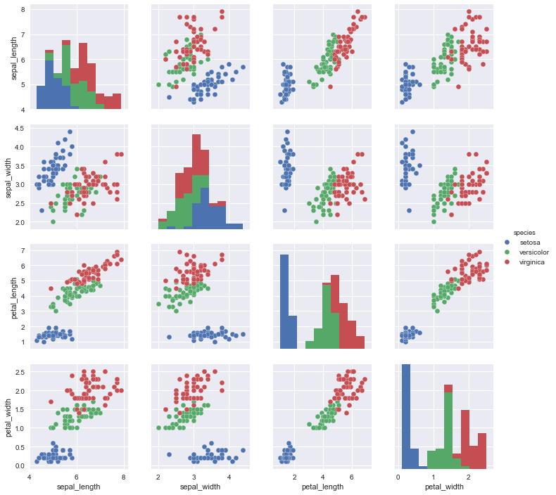
pairplot is a high-level interface for PairGrid that is intended to make it easy to draw a few common styles. You should use PairGrid directly if you need more flexibility.
sns.pairplot(iris, hue='species', size=2.5);
Facets
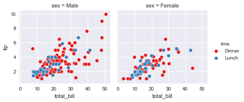
kws = dict(s=50, linewidth=.5, edgecolor="w")
g = sns.FacetGrid(tips, col="sex", hue="time", palette="Set1",
                  hue_order=["Dinner", "Lunch"])
g = (g.map(plt.scatter, "total_bill", "tip", **kws)
    .add_legend())
